Wine & Warpaint is a Richmond based alternative rock band. The four piece band recorded its debut EP in Atlanta, Georgia with well-known rock producer Matt Goldman, embarked on a summer tour in 2019 and continue to put out music and play shows.
SCOPE
Branding / Logo Design / Website and E-commerce / Merchandise Design / Video / Marketing / Social Media Strategy
INDUSTRY
Music and Entertainment
CHALLENGE
This brand new band needed a visual identity to accompany the launch of their debut EP. This full stop campaign included a logo and identity treatment, full website build with e-commerce capability, fully produced music video, full length lyric video, dynamic content for social media, and merchandise design.
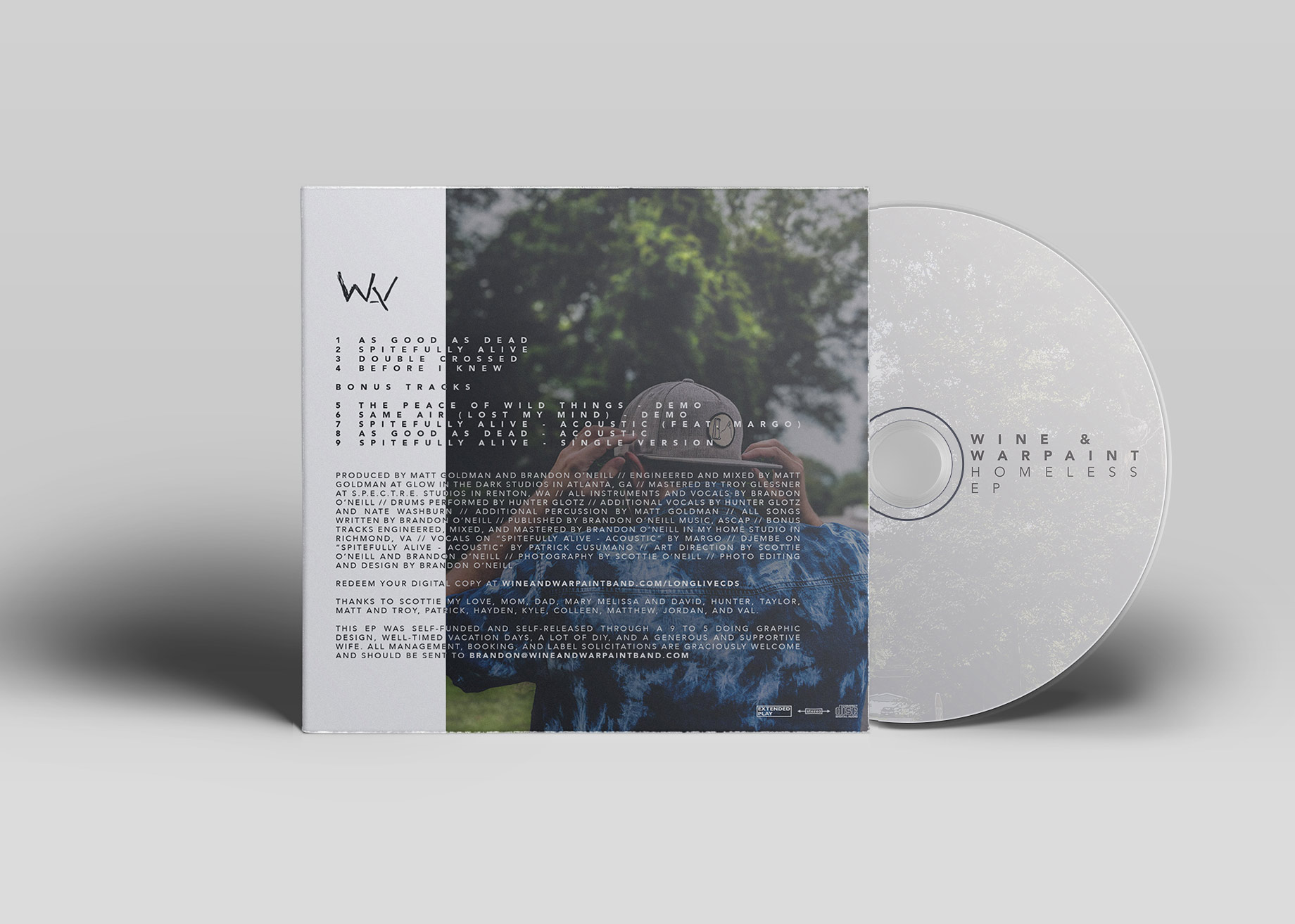
THE LOGO
The logo was built around a hand-drawn amalgamation of the first letters in the band name: W, A, W. The typeface, Avenir Next, was selected for its strong, angular features, flexibility across applications, and contrast to the hand-drawn icon. Horizontal and vertical lockups were created to cover the wide variety of placements needed throughout the campaign.
Previous
Next
VIDEO & DYNAMIC SOCIAL MEDIA CONTENT
A music video and lyric video accompanied the first two singles released from the EP, along with a fully formulated release strategy and schedule. Teaser videos were created for Instagram and Twitter that pushed viewers to the website in order to view the full videos and preorder merchandise packages designed and curated by OCC. The full active website is viewable here.
MERCHANDISE
Merch bundles accompanying the release featured two unique t-shirt designs, a sticker, a toothbrush, and the physical copy of the EP. The website supported e-commerce functionality through WooCommerce and Paypal. Pre-ordered physical bundles featured custom mockups, and later advertising featured commissioned product photography.


